Improved error window
Contents
This is an improvement (introduced in Iguana 5.0.7) that is so subtle most people probably won’t even notice it. But it’s actually just one of many little tiny important steps of making a product that ‘just works’.
Getting things so that they ‘just work’ is a most time consuming process. It takes a commitment to looking at tiny little details, trying to think though each problem and come up with solutions which creatively solve them.
The funny thing about it all is that for the most part once it’s done most users of Iguana won’t consciously appreciate it. It’s just at a sub-conscious level that everything just flows naturally.
Don’t get me wrong, I would the be the first to be critical of the Iguana Translator, from my perspective it’s a product which is still in it’s early days. The core functionality is there, it happens to knock the socks off competing technologies today out in the market place. It still has a long way in my mind to get to where I ultimately want it to go. Existing mapping technology sets a very low bar in my humble opinion, I think we can do a lot better.
In a years time what the Translator will be, will make today’s version look very rough indeed. Already Iguana 5.0.7 makes what we showed at HIMSS in February look pretty primitive. Isn’t software grand? It outdates so quickly! I always get a maintenance contracts on software so that I get all the good stuff without having to re-buy the software all the time.
But anyway, on to the error window. The error dialog in Iguana 5.0.6 had a couple of small problems:
- You couldn’t really move it out of the way, your only option was to close it.
- If you had a very big message then the dialog would be so wide and long that you end up having to scroll the window sideways to find the the [x] icon to close it.
These are small problems and tolerable in a first version. But getting a really smooth user experience is all about taking these kinks out one by one until everything just flows. It’s the difference between the user experience you get on an iPhone and an out of the box Android phone (I’ll probably get flamed by all the Android fans out there, Android is great with some wonderful ideas but it still doesn’t quite have the same smoothness and simplicity that iOS provides, just my opinion, I know I have a lot of them).
I could see these problems, and one of our customers (who likes to remain anonymous so I won’t say his name) also pointed it out. As I haven’t been coding for the last 6 months other than the odd bit of Lua, my development/design brain is going to jello I tossed the problem over the wall to my development team pointing out the issues and asked them to come up with a solution.
I really am very fortunate to have built up a small team of really top class people.
Kevin got the problem and he came up with a few ideas and got some feedback from Ron, Michelle, Eric and Zack. Together they came up with a solution I wouldn’t have thought of. It’s a piece of beautifully usable design. This is how it works.
When an exception occurs you get a small dialog (maximum of four lines) with any long lines truncated:
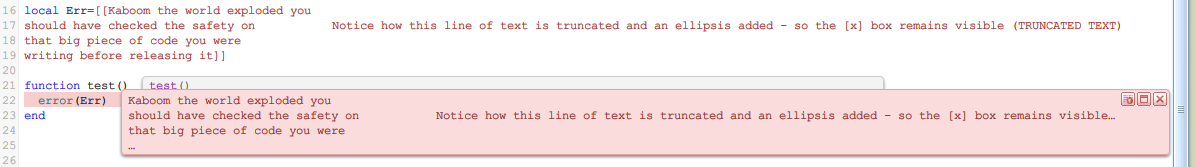
Notice that the error message hints that there is more text on the truncated line with the little ellipsis “…”. It doesn’t matter if the line is very long, the use of ellipsis to truncate the box means that the [x] is always visible to easily close the error dialog. Also there is another ellipsis on the 4th line of the dialog to indicate that there are more lines of text that are not shown.
If you glide your mouse over and pause there are a few tool tips:

Hovering over the first line of the dialog displays this tip.
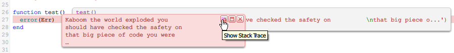
And “Stack Trace” and “Close” for the two icons on the right of the dialog. The stack trace icon opens the error stack trace window for errors making it very easy to discover. Clicking on the main part of the error dialog results in it smoothly expanding like this:
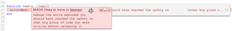
At this point the dialog has become moveable so you can drag it out of the way without closing it while you fix the error. Because the “Dismiss” link is there even if the overall width of the expanded error message is very wide there is no need to scroll horizontally in order to close the dialog. I heard there was a lot of internal debate over that choice, Kevin at one stage put the [x] button on the left hand side of the dialog. Some people on the team didn’t like that, me, I am not so sure. I know that in Windows the convention is for close [x] icons to go on the right. But I notice that with Mac OS X the convention is actually to put the the close etc. icons on the top left corner. I don’t think that is by accident. Maybe we should tweak it, I don’t know, there is room for alternative opinions at this point.
Does the “Drag to move” enhance usability by making it clear that the dialog can be moved, or does it clutter the display? That will something we’ll debate at some point. If you have an opinion, let me know.
One other little refinement I do love though is the little tooltip that is on the Dismiss link:
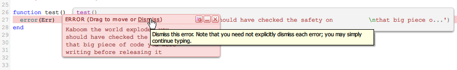
Every effort has been made to make it clear to the user that it’s not necessary to explicitly close the error dialog, it’s always been designed that way so that you don’t have to be interrupted from typing your code to go and move the mouse and click to close the dialog.
Still reading at this point? Well done! This kind of minute detail can bore the pants of many people (my wife included). It’s funny, the quality of error messages is a huge differentiator in the quality and maturity of software. Good error messages should articulately explain to the user how to resolve the error. It takes a long time to make software that has really good error messages. For me it’s disappointing when software gives you errors as a stack trace of the internal source code.
It’s something we put a lot of attention into. Ron my CTO gets fatigue from the endless stream of suggestions I raise as far as tweaking and improving our error messages. If you ever see an error message come out of Iguana that’s a little less that stellar let me know. There are some error messages that could do with improving. Some we don’t have control over since they come from underlying databases and so on. At this stage I’d say we probably rate 5 out of 10 with our error messages. A lot of very mainstream software would score substantially less than this.
So that gives you a bit of feel for some of the internal thought process we go through in our development. This kind of work can either make you glow with pride or cringe with boredom depending on your personality. It’s certainly not work that appeals to everyone but for me it’s the software I have always dreamed of writing. Making software which really flows nicely and is pleasant to use for me gives great pleasure, even if in this case I’m just the cheer leader on the side.
We often have positions for developers in our team in Toronto. For other roles we can and do hire people anywhere. Unfortunately the way the tax rules work in Canada mean that for these roles we have to hire in Toronto to do this type of work. This kind of sucks since my personal network tends to extend way out beyond Canada. About 60% of our business is in the United States and the other 35% is spread out all over the globe. I tend to come across people with right skill set everywhere but Toronto. My Canadian colleagues and family would probably crucify me if they read this, but, US annexation of Canada, bring it on! It would making hiring talent so much easier!
Any way hopefully that gives you an idea of what we look for in developers. Technically the work is being done with jQuery using a lot of custom javascript. We use controls like Code Mirror. In the backend we use C++ although in a very simple plain way, and of course the fantastic LuaJIT engine which is work of art by Mike Pall. But the precise technology is less important than the general mindset of attention to detail. It’s not the kind of work that appeals to everyone but it’s work we take great pride in at iNTERFACEWARE. If you happen to know of anyone in Toronto that would value this opportunity please feel free to introduce them to us.
Eliot Muir
CEO, iNTERFACEWARE