Let’s compare mapping patient demographics with Chameleon and the Translator
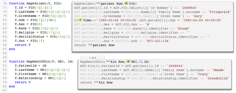
A picture can be worth a thousand words. People often don’t realize how little of the mapping process a traditional middleware GUI actually tells you. These comparative screen shots should make it more apparent. Given a simple interface where we are mapping patient demographics and next of kin this is what it would look like in the Translator:

So the Translator is showing the following:
- The mappings, in raw numerical form and in expanded text form.
- Values of the live data that is actually being mapped.
- Plus you can see there are four invocations of the part of the mapping next of kin.
- Both mappings can be seen within one screen
- It’s transparent to see that the patient ID is being passed into the MapNextOfKin
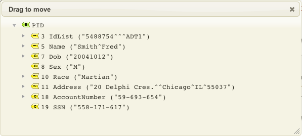
It’s really powerful way to visually see the mapping, it is truly a GUI in it own right. Furthermore as a user you can click on the objects like the patient row and the PID segment to graphically see the data like so:

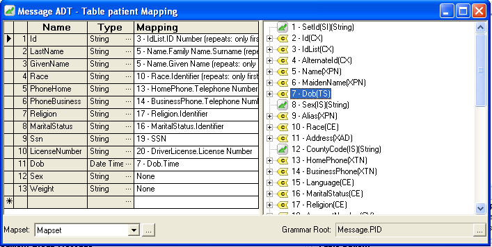
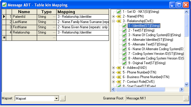
Now let’s compare the equivalent mappings with Chameleon. First of all you have to dig quite a bit of find the actual mapping screen. That’s normal for any graphical mapper. The information is then fragmented between two windows:

and

As you can see the graphical screens in Chameleon do not have any more information than the Translator screens. They have less. Comparing the screens:
- The Translator screens show live data which is not shown in Chameleon screens which separate the configuration from the testing environment.
- We cannot see how how many times the next of kin mapping is invoked using this GUI.
- The Chameleon GUI is pretty fiddly. There is a lot of busy work required to manipulate the splitter windows and scroll bars.
- The Translator is much more transparent, everything can seen within a single window.
- The GUI does not show how we get the patient ID key into the NextOfKin table. This would need to be done elsewhere.
Obviously the Translator is a more modern interface, you’d hope so, iNTERFACEWARE has been in business since 1997 so it’s a reasonable expectation that we have learnt one or two things since then. Modern web browsers provide a much more powerful environment to make great GUIs compared to what was possible in 1997 using Windows, which is when the bulk of Chameleon was written.
Things get worse for Chameleon once you throw in the requirement for doing any kind of logic which cannot be done using straight graphical mapping. This is more the rule than the exception (see my blog again). It’s not transparent at all when python scripting comes into the mix.
Eliot Muir, CEO of iNTERFACEWARE
Next: Managing custom code development is a pain in the proverbial
